Forms Rendering
The appearance of forms can be very diverse. In practice, we may encounter two extremes. On one hand, there is the need to
render numerous forms in an application that are visually identical, and we appreciate the easy rendering without a template using
$form->render(). This is typically the case with administrative interfaces.
On the other hand, there are diverse forms where each one is unique. Their appearance is best described using HTML in the form template. And of course, besides these two extremes, we encounter many forms that fall somewhere in between.
Rendering With Latte
The Latte templating system significantly simplifies the rendering of forms and their elements. First, we'll demonstrate how to render forms manually, element by element, to gain full control over the code. Later, we will show how such rendering can be automated.
You can generate the Latte template for the form using the
Nette\Forms\Blueprint::latte($form) method, which outputs it to the browser page. Then, simply click to select the
code and copy it into your project.
{control}
The simplest way to render a form is to write in the template:
{control signInForm}
The appearance of the rendered form can be influenced by configuring the Renderer and individual controls.
n:name
Linking the form definition in PHP code with HTML code is extremely easy. Just add the n:name attributes.
It's that simple!
protected function createComponentSignInForm(): Form
{
	$form = new Form;
	$form->addText('username')->setRequired();
	$form->addPassword('password')->setRequired();
	$form->addSubmit('send');
	return $form;
}
<form n:name=signInForm class=form>
	<div>
		<label n:name=username>Username: <input n:name=username size=20 autofocus></label>
	</div>
	<div>
		<label n:name=password>Password: <input n:name=password></label>
	</div>
	<div>
		<input n:name=send class="btn btn-default">
	</div>
</form>
You have full control over the appearance of the resulting HTML code. If you use the n:name attribute with
<select>, <button>, or <textarea> elements, their inner content is
automatically populated. Additionally, the <form n:name> tag creates a local variable $form
containing the rendered form object, and the closing </form> tag renders any unrendered hidden controls (the
same applies to {form} ... {/form}).
However, we must not forget to render potential error messages. This includes errors added to individual controls using the
addError() method (rendered via {inputError}) and errors added directly to the form (returned by
$form->getOwnErrors()):
<form n:name=signInForm class=form>
	<ul class="errors" n:ifcontent>
		<li n:foreach="$form->getOwnErrors() as $error">{$error}</li>
	</ul>

	<div>
		<label n:name=username>Username: <input n:name=username size=20 autofocus></label>
		<span class=error n:ifcontent>{inputError username}</span>
	</div>
	<div>
		<label n:name=password>Password: <input n:name=password></label>
		<span class=error n:ifcontent>{inputError password}</span>
	</div>
	<div>
		<input n:name=send class="btn btn-default">
	</div>
</form>
More complex form controls, like RadioList or CheckboxList, can be rendered item by item like this:
{foreach $form[gender]->getItems() as $key => $label}
	<label n:name="gender:$key"><input n:name="gender:$key"> {$label}</label>
{/foreach}
{label} {input}
Prefer not to think about which HTML element to use for each control in the template, whether it's <input>,
<textarea>, etc.? The solution is the universal {input} tag:
<form n:name=signInForm class=form>
	<ul class="errors" n:ifcontent>
		<li n:foreach="$form->getOwnErrors() as $error">{$error}</li>
	</ul>

	<div>
		{label username}Username: {input username, size: 20, autofocus: true}{/label}
		{inputError username}
	</div>
	<div>
		{label password}Password: {input password}{/label}
		{inputError password}
	</div>
	<div>
		{input send, class: "btn btn-default"}
	</div>
</form>
If the form uses a translator, labels rendered from the form definition (e.g. {label username /}) are translated.
Text written directly between the {label} and {/label} tags is not.
Again, more complex form controls, such as RadioList or CheckboxList, can be rendered item by item:
{foreach $form[gender]->items as $key => $label}
	{label gender:$key}{input gender:$key} {$label}{/label}
{/foreach}
To render just the <input> for a Checkbox control, use {input myCheckbox:}. In this case,
always separate HTML attributes with a comma: {input myCheckbox:, class: required}.
{inputError}
Displays the error message for a form control, if one exists. The message is usually wrapped in an HTML element for styling.
Preventing the rendering of an empty element when there is no message can be elegantly achieved using
n:ifcontent:
<span class=error n:ifcontent>{inputError $input}</span>
We can check for the presence of an error using the hasErrors() method and set the class of the parent element
accordingly:
<div n:class="$form[username]->hasErrors() ? 'error'">
	{input username}
	{inputError username}
</div>
{form}
The tags {form signInForm}...{/form} are an alternative to
<form n:name="signInForm">...</form>. Separate any arguments from the name with a comma:
{form signInForm, class: foo}.
The scope keyword placed before the name only pushes the form onto the stack (so that
{input}, {label}, etc. bind to it) but does not render the <form> tag. It is handy
for rendering a part of a form, e.g. in a snippet. If a form is already active, the name is resolved relatively to it, so
{form scope} also replaces {formContainer}:
{form scope signInForm}
	{input username}
{/form}
The detached keyword renders an empty <form></form> and links every
control to it via the HTML form attribute. This lets you place a form inside another form, which HTML otherwise
forbids. The detached form must have an HTML id, which is generated automatically when you give it a name (like
outerForm below):
{form detached outerForm}
	...
{/form}
Automatic Rendering
Thanks to the {input} and {label} tags, we can easily create a generic template for any form. It will
iterate through and render all its controls, except for hidden controls, which are rendered automatically when the form is closed
with the </form> tag. It expects the name of the form to be rendered in the $form variable.
<form n:name=$form class=form>
	<ul class="errors" n:ifcontent>
		<li n:foreach="$form->getOwnErrors() as $error">{$error}</li>
	</ul>

	<div n:foreach="$form->getControls() as $input"
		n:if="$input->getOption(type) !== hidden">
		{label $input /}
		{input $input}
		{inputError $input}
	</div>
</form>
The self-closing pair tags {label .../} used here display the labels originating from the form definition in the
PHP code.
Save this generic template, for example, in the file basic-form.latte. To render the form, simply include it and
pass the form name (or instance) to the $form parameter:
{include basic-form.latte, form: signInForm}
If you want to modify the appearance of a specific form during rendering, perhaps rendering one control differently, the easiest way is to prepare blocks in the template that can be subsequently overridden. Blocks can also have dynamic names, allowing you to insert the name of the rendered control. For example:
...
	{label $input /}
	{block "input-{$input->name}"}{input $input}{/block}
...
For a control named, e.g., username, this creates the block input-username, which can be easily
overridden using the {embed} tag:
{embed basic-form.latte, form: signInForm}
	{block input-username}
		<span class=important>
			{include parent}
		</span>
	{/block}
{/embed}
Alternatively, the entire content of the basic-form.latte template can be defined as a block, including the $form
parameter:
{define basic-form, $form}
	<form n:name=$form class=form>
		...
	</form>
{/define}
This makes calling it slightly simpler:
{embed basic-form, signInForm}
	...
{/embed}
The block only needs to be imported in one place, at the beginning of the layout template:
{import basic-form.latte}
Special Cases
If you need to render only the inner part of the form without the <form> HTML tags, for example, when
sending snippets, hide them using the n:tag-if attribute:
<form n:name=signInForm n:tag-if=false>
	<div>
		<label n:name=username>Username: <input n:name=username></label>
		{inputError username}
	</div>
</form>
The {formContainer} tag, or the newer {form scope}, helps with rendering
controls inside a form container.
<p>Which news you wish to receive:</p>

{formContainer emailNews}
<ul>
	<li>{input sport} {label sport /}</li>
	<li>{input science} {label science /}</li>
</ul>
{/formContainer}
Rendering Without Latte
The easiest way to render a form is to call:
$form->render();
The appearance of the rendered form can be influenced by configuring the Renderer and individual controls.
Manual Rendering
Each form control has methods that generate the HTML code for the form field and its label. They can return it either as a string or a Nette\Utils\Html object:
getControl(): Html|stringreturns the HTML code of the controlgetLabel($caption = null): Html|string|nullreturns the HTML code of the label, if it exists
This allows the form to be rendered element by element:
<?php $form->render('begin') ?>
<?php $form->render('ownerrors') ?>

<div>
	<?= $form['name']->getLabel() ?>
	<?= $form['name']->getControl() ?>
	<span class=error><?= htmlspecialchars((string) $form['name']->getError()) ?></span>
</div>

<div>
	<?= $form['age']->getLabel() ?>
	<?= $form['age']->getControl() ?>
	<span class=error><?= htmlspecialchars((string) $form['age']->getError()) ?></span>
</div>

// ...

<?php $form->render('end') ?>
While for some controls getControl() returns a single HTML element (e.g., <input>,
<select>, etc.), for others it returns a complete piece of HTML code (CheckboxList, RadioList). In such cases,
you can use methods that generate individual inputs and labels for each item separately:
getControlPart($key = null): Htmlreturns the HTML code of a single itemgetLabelPart($key = null): Htmlreturns the HTML code for the label of a single item
These methods have the prefix get for historical reasons, but generate would be more
appropriate, as they create and return a new Html element upon each call.
Renderer
This is an object responsible for rendering the form. It can be set using the $form->setRenderer() method.
Control is passed to it when the $form->render() method is called.
If we do not set a custom renderer, the default renderer Nette\Forms\Rendering\DefaultFormRenderer will be used. This renders the form controls into an HTML table. The output looks like this:
<table>
<tr class="required">
	<th><label class="required" for="frm-name">Name:</label></th>

	<td><input type="text" class="text" name="name" id="frm-name" required value=""></td>
</tr>

<tr class="required">
	<th><label class="required" for="frm-age">Age:</label></th>

	<td><input type="text" class="text" name="age" id="frm-age" required value=""></td>
</tr>

<tr>
	<th><label>Gender:</label></th>
	...
Whether to use a table for the form structure is debatable, and many web designers prefer different markup, such as a
definition list. Therefore, we will reconfigure DefaultFormRenderer to render the form as a list. Configuration is
done by editing the $wrappers array.
The first index always represents an area, and the second its attribute. The individual areas are shown in the picture:
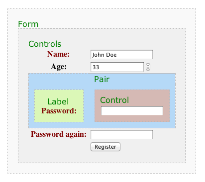
By default, the controls group is wrapped in <table>, each pair represents a table
row <tr>, and the label and control pair are cells <th> and
<td>. Now we will change the wrapping elements. We will place the controls area into a
<dl> container, leave the pair area without a container, put the label into
<dt>, and finally wrap the control with <dd> tags:
$renderer = $form->getRenderer();
$renderer->wrappers['controls']['container'] = 'dl';
$renderer->wrappers['pair']['container'] = null;
$renderer->wrappers['label']['container'] = 'dt';
$renderer->wrappers['control']['container'] = 'dd';

$form->render();
This results in the following HTML code:
<dl>
	<dt><label class="required" for="frm-name">Name:</label></dt>

	<dd><input type="text" class="text" name="name" id="frm-name" required value=""></dd>


	<dt><label class="required" for="frm-age">Age:</label></dt>

	<dd><input type="text" class="text" name="age" id="frm-age" required value=""></dd>


	<dt><label>Gender:</label></dt>
	...
</dl>
The wrappers array allows influencing many other attributes:
- adding CSS classes to individual types of form controls
- distinguishing odd and even rows with CSS classes
- visually distinguishing required and optional items
- determining whether error messages are displayed directly next to controls or above the form
Options
The behavior of the Renderer can also be controlled by setting options on individual form controls. This way, you can set a description that appears next to the input field:
$form->addText('phone', 'Number:')
	->setOption('description', 'This number will remain hidden');
If we want to place HTML content within it, we use the Html class:
use Nette\Utils\Html;

$form->addText('phone', 'Phone:')
	->setOption('description', Html::el('p')
		->setHtml('<a href="...">Terms of service.</a>')
	);
An Html element can also be used instead of a label: $form->addCheckbox('conditions', $label).
Grouping Inputs
The Renderer allows grouping controls into visual groups (fieldsets):
$form->addGroup('Personal data');
After creating a new group, it becomes active, and every newly added control is also added to it. Thus, the form can be built this way:
$form = new Form;
$form->addGroup('Personal data');
$form->addText('name', 'Your name:');
$form->addInteger('age', 'Your age:');
$form->addEmail('email', 'Email:');

$form->addGroup('Shipping address');
$form->addCheckbox('send', 'Ship to address');
$form->addText('street', 'Street:');
$form->addText('city', 'City:');
$form->addSelect('country', 'Country:', $countries);
The renderer draws groups first, followed by the controls that do not belong to any group.
Bootstrap Support
You can find examples in the examples directory showing how to configure the Renderer for Twitter Bootstrap 2, Bootstrap 3, and Bootstrap 4.
HTML Attributes
To set any HTML attributes for form controls, use the setHtmlAttribute(string $name, $value = true) method:
$form->addInteger('number', 'Number:')
	->setHtmlAttribute('class', 'big-number');

$form->addSelect('rank', 'Order by:', ['price', 'name'])
	->setHtmlAttribute('onchange', 'submit()'); // submit the form on change


// To set attributes of the <form> element itself
$form->setHtmlAttribute('id', 'myForm');
Specifying the type of control:
$form->addText('tel', 'Your telephone:')
	->setHtmlType('tel')
	->setHtmlAttribute('placeholder', 'Please, fill in your telephone');
Setting the type and other attributes is only for visual purposes. Verification of input correctness must occur on the server side, which you ensure by choosing an appropriate form control and specifying validation rules.
For individual items in radio or checkbox lists, we can set an HTML attribute with different values for each. Notice the colon
after style:, which ensures the value is selected based on the key:
$colors = ['r' => 'red', 'g' => 'green', 'b' => 'blue'];
$styles = ['r' => 'background:red', 'g' => 'background:green'];
$form->addCheckboxList('colors', 'Colors:', $colors)
	->setHtmlAttribute('style:', $styles);
Renders:
<label><input type="checkbox" name="colors[]" style="background:red" value="r">red</label>
<label><input type="checkbox" name="colors[]" style="background:green" value="g">green</label>
<label><input type="checkbox" name="colors[]" value="b">blue</label>
For setting boolean attributes, such as readonly, we can use the notation with a question mark:
$form->addCheckboxList('colors', 'Colors:', $colors)
	->setHtmlAttribute('readonly?', 'r'); // use an array for multiple keys, e.g., ['r', 'g']
Renders:
<label><input type="checkbox" name="colors[]" readonly value="r">red</label>
<label><input type="checkbox" name="colors[]" value="g">green</label>
<label><input type="checkbox" name="colors[]" value="b">blue</label>
For select boxes, the setHtmlAttribute() method sets the attributes of the <select> element. If
we want to set attributes for individual <option> elements, we use the setOptionAttribute()
method. The colon and question mark notations mentioned above also work:
$form->addSelect('colors', 'Colors:', $colors)
	->setOptionAttribute('style:', $styles);
Renders:
<select name="colors">
	<option value="r" style="background:red">red</option>
	<option value="g" style="background:green">green</option>
	<option value="b">blue</option>
</select>
Prototypes
An alternative way to set HTML attributes is to modify the template from which the HTML element is generated. The template is
an Html object and is returned by the getControlPrototype() method:
$input = $form->addInteger('number', 'Number:');
$html = $input->getControlPrototype(); // <input>
$html->class('big-number');            // <input class="big-number">
The label template returned by getLabelPrototype() can also be modified in this way:
$html = $input->getLabelPrototype(); // <label>
$html->class('distinctive');         // <label class="distinctive">
For Checkbox, CheckboxList, and RadioList controls, you can influence the template of the element that wraps the entire
control. It is returned by getContainerPrototype(). By default, it is an “empty” element, so nothing is rendered,
but by giving it a name, it will be rendered:
$input = $form->addCheckbox('send');
$html = $input->getContainerPrototype();
$html->setName('div'); // <div>
$html->class('check'); // <div class="check">
echo $input->getControl();
// <div class="check"><label><input type="checkbox" name="send"></label></div>
In the case of CheckboxList and RadioList, you can also influence the template of the separator for individual items, returned
by the getSeparatorPrototype() method. By default, it is the <br> element. If you change it to a
pair element, it will wrap the individual items instead of separating them. Furthermore, you can influence the template of the
HTML element for the labels of individual items, returned by getItemLabelPrototype().
Translating
If you are developing a multilingual application, you will likely need to render the form in different language versions. The Nette Framework defines a translation interface for this purpose: Nette\Localization\Translator. Nette does not have a default implementation; you can choose from several ready-made solutions found on Componette according to your needs. Their documentation explains how to configure the translator.
Forms support outputting texts via the translator. We pass it using the setTranslator() method:
$form->setTranslator($translator);
From this point on, not only all labels but also all error messages, items in select boxes, and input placeholders will be translated into the target language.
It is possible to set a different translator for individual form controls or disable translation completely by setting the
value to null:
$form->addSelect('carModel', 'Model:', $cars)
	->setTranslator(null);
For validation rules, specific parameters are also passed to the translator. For example, for the rule:
$form->addPassword('password', 'Password:')
	->addRule($form::MinLength, 'Password must be at least %d characters long', 8);
the translator is called with these parameters:
$translator->translate('Password must be at least %d characters long', 8);
and thus can choose the correct plural form for the word characters based on the count.
Event onRender
Just before the form is rendered, we can have our code invoked. This code can, for example, add HTML classes to the form
controls for correct display. We add the code to the onRender array:
$form->onRender[] = function ($form) {
	BootstrapCSS::initialize($form);
};